
Hyrcan Group
Categories
Property
Client
Hyrcan Group
Project
Brand Identity Design
Services
Branding
Year
2026
Hyrcan Group engaged Other Asset to develop an ownable brand identity for its property development and project management business. The challenge was to create a premium identity that reflected the company’s position while giving meaning to the Iranian heritage behind the Hyrcan name.
The name Hyrcan is inspired by the Hyrcanian Forest, a region of ancient woodland along Iran’s Caspian coast. This provided a rich foundation for the visual direction, exploring themes of heritage, culture and prestige through form, colour and symbolism.
An identity grounded
in Iranian heritage.
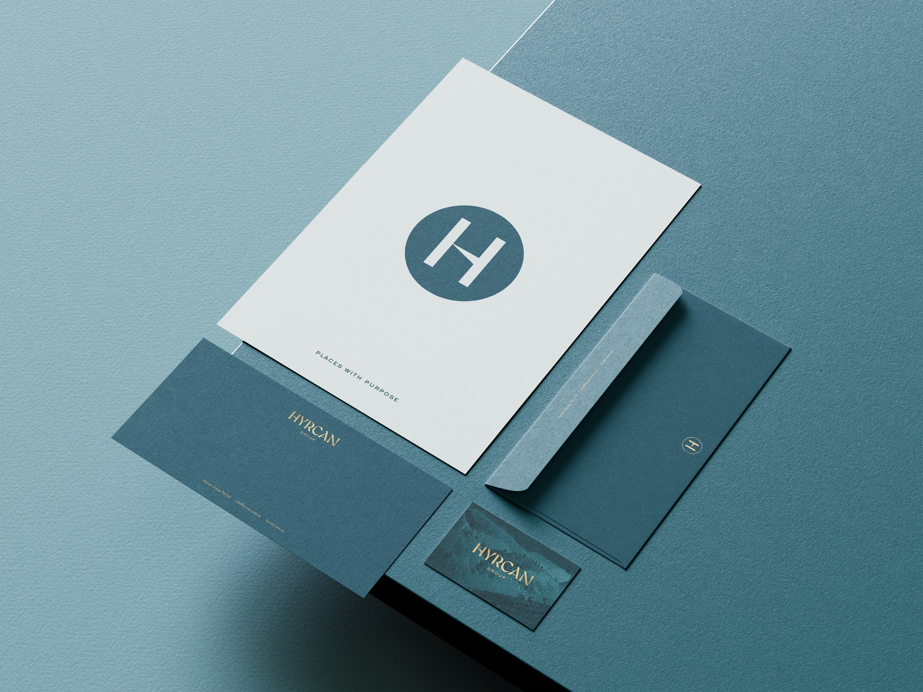
The identity features angular, calligraphy-inspired letterforms influenced by Iranian typography and cultural references, creating a wordmark with a strong sense of character and place. A rich teal and gold palette reinforces the brand’s premium positioning while adding warmth and depth to the visual language.

A textural embossed pattern, inspired by the forms and density of the Hyrcanian Forest, extends the visual language beyond the wordmark. Used as a supporting graphic device, it creates a tactile connection to the landscape while adding depth and flexibility across brand applications.
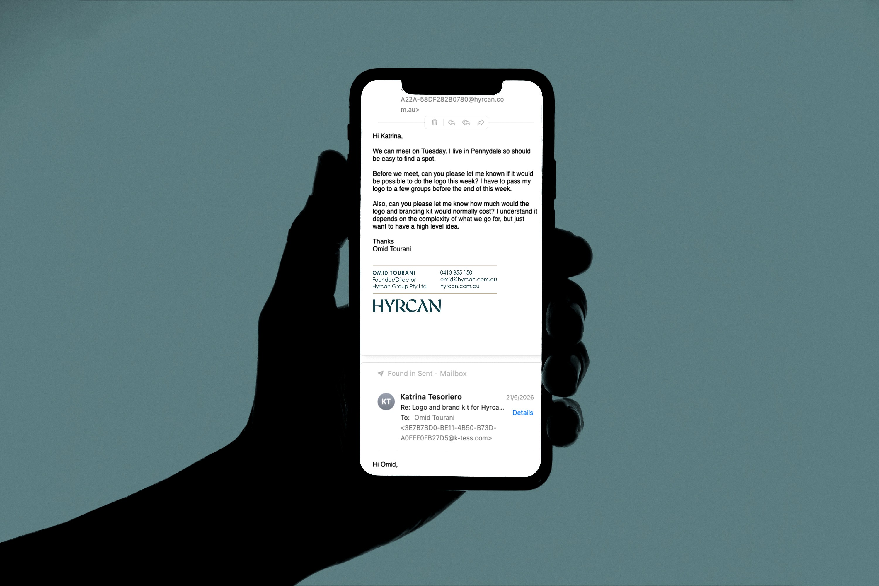
The result is a contemporary property brand with a strong sense of heritage, balancing premium positioning with the cultural meaning embedded in the Hyrcan name.


Hyrcan Group
Categories
Property
Client
Hyrcan Group
Project
Brand Identity Design
Services
Branding
Year
2026
Hyrcan Group engaged Other Asset to develop an ownable brand identity for its property development and project management business. The challenge was to create a premium identity that reflected the company’s position while giving meaning to the Iranian heritage behind the Hyrcan name.
The name Hyrcan is inspired by the Hyrcanian Forest, a region of ancient woodland along Iran’s Caspian coast. This provided a rich foundation for the visual direction, exploring themes of heritage, culture and prestige through form, colour and symbolism.
An identity grounded
in Iranian heritage.
Content
The identity features angular, calligraphy-inspired letterforms influenced by Iranian typography and cultural references, creating a wordmark with a strong sense of character and place. A rich teal and gold palette reinforces the brand’s premium positioning while adding warmth and depth to the visual language.
Content
A textural embossed pattern, inspired by the forms and density of the Hyrcanian Forest, extends the visual language beyond the wordmark. Used as a supporting graphic device, it creates a tactile connection to the landscape while adding depth and flexibility across brand applications.
The result is a contemporary property brand with a strong sense of heritage, balancing premium positioning with the cultural meaning embedded in the Hyrcan name.
Content
Content
Hyrcan Group
Categories
Property
Client
Hyrcan Group
Project
Brand Identity Design
Services
Branding
Year
2026
Hyrcan Group engaged Other Asset to develop an ownable brand identity for its property development and project management business. The challenge was to create a premium identity that reflected the company’s position while giving meaning to the Iranian heritage behind the Hyrcan name.
The name Hyrcan is inspired by the Hyrcanian Forest, a region of ancient woodland along Iran’s Caspian coast. This provided a rich foundation for the visual direction, exploring themes of heritage, culture and prestige through form, colour and symbolism.
An identity grounded
in Iranian heritage.
Content
The identity features angular, calligraphy-inspired letterforms influenced by Iranian typography and cultural references, creating a wordmark with a strong sense of character and place. A rich teal and gold palette reinforces the brand’s premium positioning while adding warmth and depth to the visual language.
Content
A textural embossed pattern, inspired by the forms and density of the Hyrcanian Forest, extends the visual language beyond the wordmark. Used as a supporting graphic device, it creates a tactile connection to the landscape while adding depth and flexibility across brand applications.
The result is a contemporary property brand with a strong sense of heritage, balancing premium positioning with the cultural meaning embedded in the Hyrcan name.
Content
Content
Content